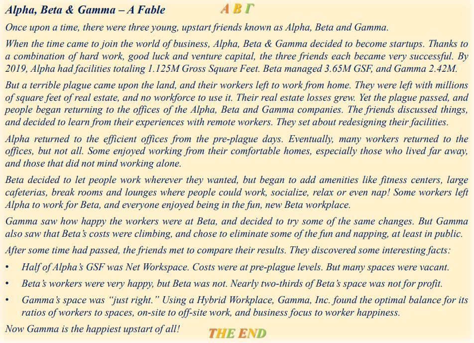
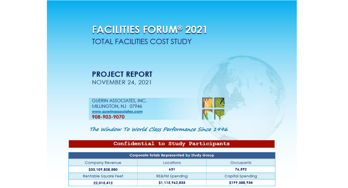
CREWS 8: Radar, Value & Other Great Charts
RADAR, VALUE & OTHER GREAT CHARTS
Many charts have been used in this series, and most are not repeated here. See Chapters 1 thru 7 for numerous examples of how to illustrate and analyze data, and present conclusions in a streamlined, time-saving way. This “Visual Management” approach affords major advantages presenting findings to varied audiences from senior management to colleagues, employees, service providers and outside parties.
This chapter presents several additional charts, and new information not previously used.
Radar Charts, for example, are excellent vehicles for comprehensive criteria across numerous samples.
- Overall benchmarking comparisons among companies, sites, or facilities
- Comprehensive RFI/RFP overview of outsourcing candidate results
Value Charts (CREWS 4: Three Key Dimensions of Value) illustrate the differing interests of stakeholders:
- Shareholders seek improved investment return through cost control.
- Employees are most interested in workplace features, services, and amenities.
- Management seeks optimal balance for sustainable productivity and profit.
Traffic Light Charts allow simultaneous evaluation of numerous functional areas across a range of factors. This permits the identification of whether underperformance is located primarily within a specific functional area (e.g. Maintenance & Operations), or across a number of functional areas in a particular aspect of performance. For example, there may be a need for enhanced training in several areas, indicating a departmental issue.
The following examples represent a brief selection of charts used to enhance the communication of results.
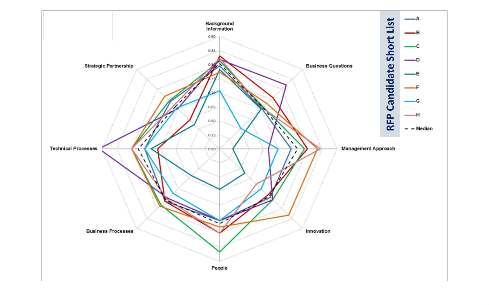
RADAR CHARTS: USED FOR OVERALL COMPARISONS ...
Radar Charts (aka Spider Charts) consolidate multiple criteria for groups of firms, locations, or facilities.

… RFI / RFP CONTRACTOR SELECTION …
Radar Charts compare and analyze RFI & RFP (Requests For Information / Proposals) data. This outsourcing project began with 50+ potential service providers for Maintenance & Operational Services for an organization in the Philadelphia area, with US locations. After surveys, data collection, and analysis, the group was narrowed to the shortlist of eight here, and ultimately to the selected successful company for a global, 7-year contract.
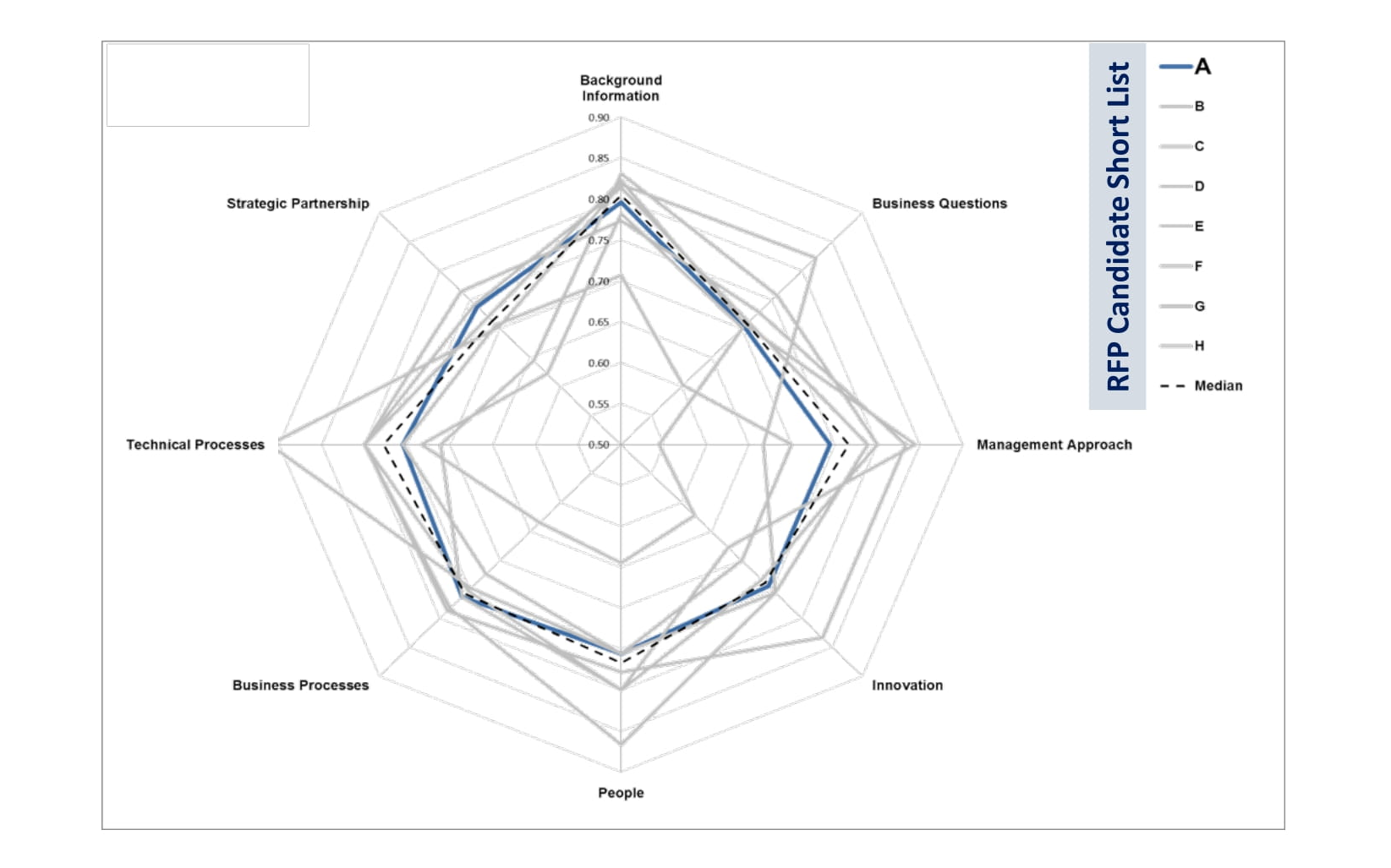
… AND INDIVIDUAL VENDOR ANALYSIS
This view of the data shows an individual bidder (Company A) vs. the group median. This variation allows for inspection of the differences between two or more individual firms, between one firm and median values, etc.
Radar charts make excellent models for illustrating strengths and weaknesses at a glance.
VALUE CHARTS ILLUSTRATE DIFFERENT INTERESTS …
Shareholders are most concerned with Return On Equity, which in the short term depends on lowering costs.
Employees in the Workplace are most interested in the features, services, and amenities which improve their environment, well-being, and ability to perform.
Management must strike the optimal balance between these values for sustainable productivity and profit.
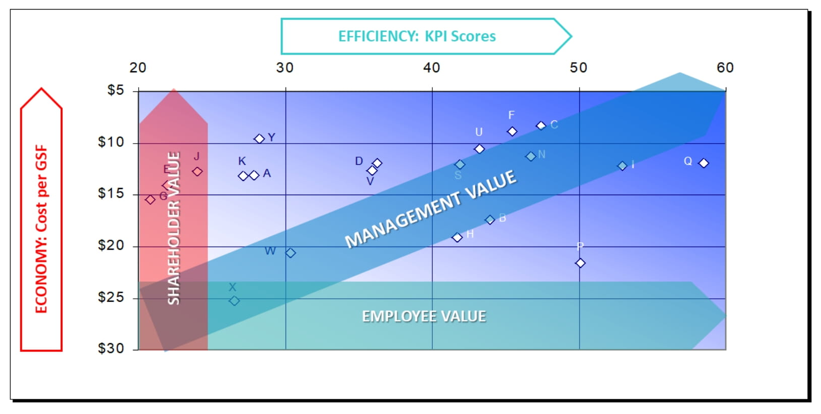
… AND IDENTIFY IMPROVEMENT NEEDS …
This Value Chart for Maintenance & Operations shows Total Costs and Key Performance Indicator (KPI) scores.
Each KPI is weighted by importance, with life safety highest and minor repairs and comfort issues rated lowest.
Cost is rated higher than KPIs for this firm (Co. CL). For them, a higher value will require better cost control.

… BASED ON CLEAR IMPROVEMENT TARGETS.
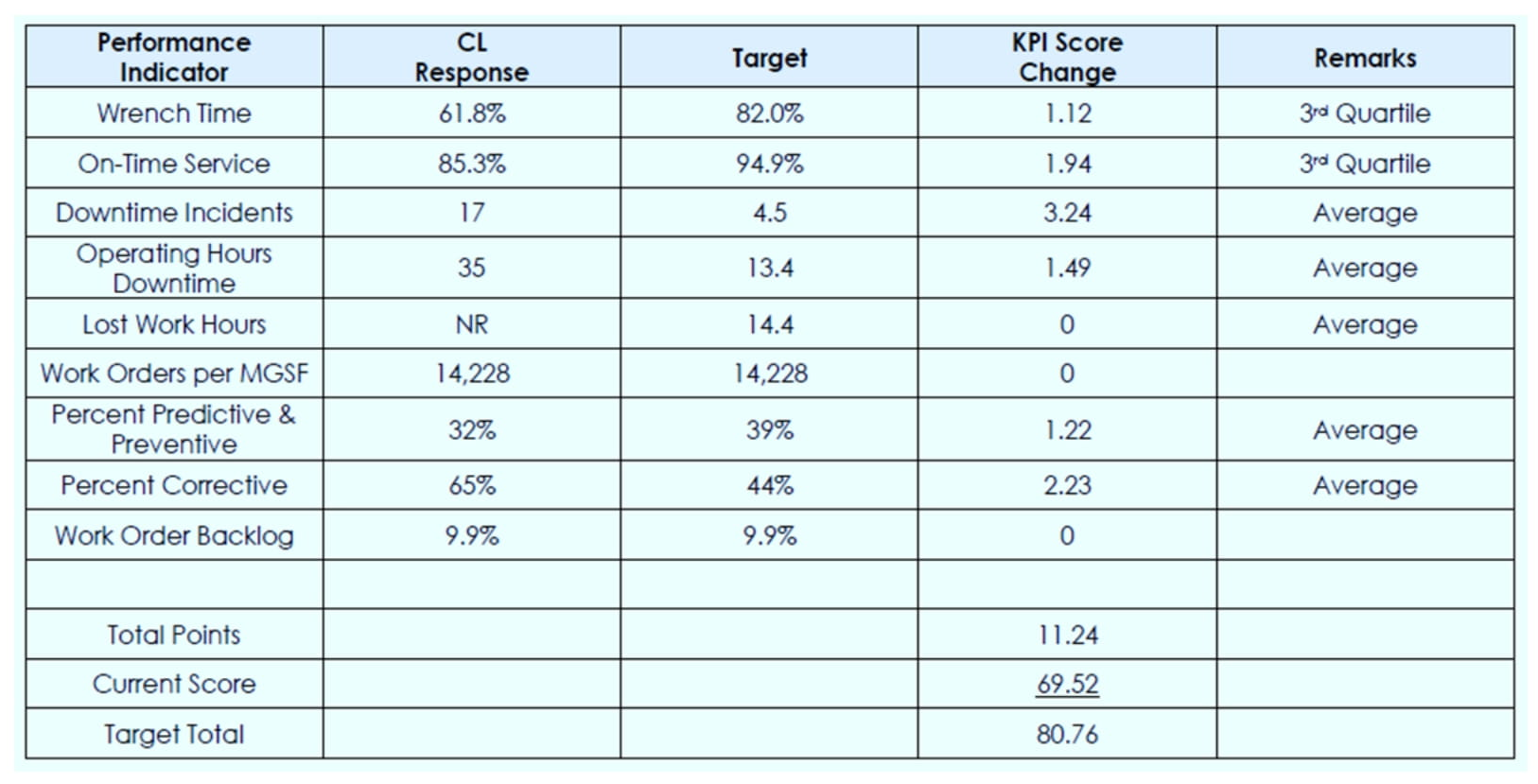
KEY PERFORMANCE INDICATORS: MAINTENANCE & OPERATIONS
Shown here are improvement targets required for Company CL, to achieve a performance level of 80.76 out of a possible 100 points. This represents the first of three years of combined cost reductions and service level improvements, in order to achieve the top quartile and Best Performer status.
TRAFFIC LIGHT CHARTS
KEY PERFORMANCE INDICATORS: MAINTENANCE & OPERATIONS
Quartile colors indicate performance by functional area (Maintenance & Operations, Custodial & Janitorial, etc.) across each of four Critical Success Factors (from a total of seven). Patterns reveal where improvement needs lie within a functional area (e.g. Lab Services), or in a CSF across all areas (e.g. Learning Organization)

CONCLUSION
WHY IT’S IMPORTANT
It’s essential to establish measurable goals and achievements. It’s also important to find ways to communicate the messages conveyed by large amounts of data in a clear, compelling way with a minimum of delay.
We have found that charts such as those used in this series are remarkably successful in achieving these goals. They combine the advantages of clarity, through best practices in graphic design, with the benefit of impartiality, which is reinforced through methods of presentation and clarifying analysis.
We welcome your comments or questions on these materials or your suggestions for additional tools and techniques. In an era of increasing volume and speed of incoming data, solutions that simplify its absorption and transmission are of real value. These charts are intended as examples to illustrate that point.

HOW WE CAN HELP
We’ve conducted studies for a wide range of firms, many of them. leaders in their industries, who recognize the advantages of a leadership position. We provide them with rigorous, thoughtful evaluations based on our 25+ years of CREWS consulting experience, plus our prior 10+ years’ hands-on knowledge of the field.
Our evaluations show how to raise performance while reducing costs, by establishing and attaining aggressive but achievable goals for the organization. We can provide evaluations tailored to your own portfolio, facilities, workplace, staffing, and other management responsibilities, and help you become the best performer
THANK YOU!
The post CREWS 8: Radar, Value & Other Great Charts first appeared on GUERIN ASSOCIATES, INC.